

OCTOBER 16, 2025
It would go a little like this.
A college freshman walks into the university clinic with a sore throat. Before they can even sit down, a poster on the bulletin board spells their doom. One hookup after a party last week, the chart suggests, has “exposed” them not just to that person, but to everyone that person has ever hooked up with—and everyone those people have ever been with, and so on. By the end, our hapless freshman is linked to thousands and thousands of strangers, all strung together like some far-reaching epidemiological conspiracy.
The nurse leans in and asks, “How many partners have you had?” The freshman, now wide-eyed, stammers out something like a number. The nurse glares toward the poster. Stick figures and arrows snake across it, multiplying every word. “How many partners have you had?”
The more you admit to, the grander the imagined outbreak. The chart leers. “For the love of Saint Pete! What have I done?!?!”
The message lands hard. Our enlightened freshman swears off casual sex forever and walks out of the clinic resolved to keep their “number” as close to zero as possible. And in so doing, maybe—just maybe—they’ll avoid an STI forever.
Yeah, no.
The sexual exposure chart, pinned on boards in clinics and university health centers across the country and perhaps beyond, has long haunted how we think about intimacy and connection.
The sexual exposure chart, pinned on boards in clinics and university health centers across the country and perhaps beyond, has long haunted how we think about intimacy and connection. Born of failed abstinence-only and sexual risk avoidance education tactics, it frames sexual intimacy as a (math) problem—a chain of contamination rather than connection.
Considering it at face value, the chart’s math just doesn’t math. The truth is, real-world networks are rarely perfectly exponential. Sexual networks overlap, especially in some communities. Worse yet, the chart doesn’t report actual disease transmission probability, and it completely erases protective factors like regular testing, condoms, PrEP, and DoxyPEP. By portraying risk as an endlessly expanding web, it exaggerates danger and obscures reality.
With “data” like these weaponized and dressed up as medicine in the very clinics where many young people may first seek care on their own, it’s no wonder, as reported by Vice, that young people today are more likely than older generations to ask—and judge—each other by their “body count” (i.e., number of past sexual partners). And so, what’s packaged as supportive health promotion festers into a suffocating subtext conditioning us to surveil ourselves and shame each other.
Beyond its tawdry relationship to facts, the sexual risk exposure chart is a good reminder that data visualizations are never neutral; they’re cultural artifacts with agendas of their own. This particular overused artifact obscures joy, pleasure, and connection while centering danger. It legitimizes stigma and a particularly narrow view of morality in the sterile language of epidemiology. Now, I don’t purport to know Mark Twain’s thoughts on today’s hookup culture, but charts like these must have been what he meant when he said there are “three types of lies: lies, damned lies, and statistics.”
Of course, many young people will eventually unlearn this unasked-for baggage, forgetting the chart in favor of healthier, more affirming visions of sexuality. But this will take time—years, even decades. What damage will the sexual exposure chart—and the broader cultural obsession with body counts—cause in the meantime?
A few weeks ago, I wrote about how sexual health messages often backfire—repelling people who will go to great lengths to avoid guilt, shame, and embarrassment away from the very clinics designed to help them. And as far as data visualizations go, there may be no greater backfire-r than the sexual exposure chart.
That’s why I think it’s high time for us, as a field, to tear these charts from our bulletin boards and confront their harmful, misleading, and self-defeating messages head-on.
That’s why I think it’s high time for us, as a field, to tear these charts from our bulletin boards and confront their harmful, misleading, and self-defeating messages head-on. That means acknowledging the damage done by past scare tactics, rejecting “body count” discourse as regressive junk science, and affirming that sex can be safe, pleasurable, and human. That’s why, to promote two clinics in Baltimore, we created a series of visuals to call out just how bananas the sexual exposure chart truly is—and set the record straight: It’s not about how many people you hook up with, it’s about how you hook up that matters.
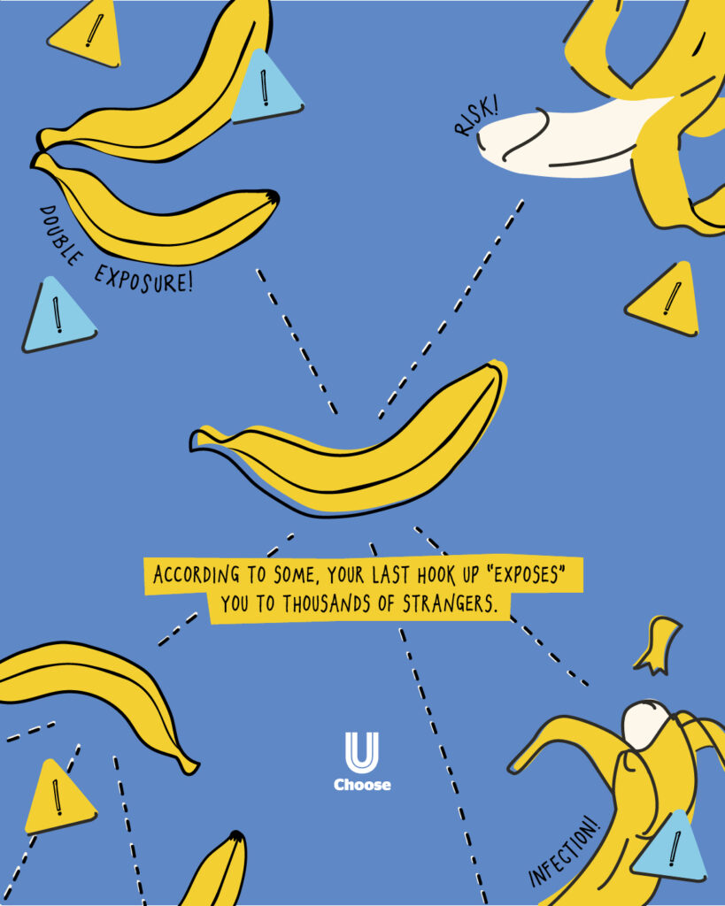
Pearl-clutchers and health class Karens love to tell you your last hookup “exposed” you to so many people, who “exposed” you to so many more people, who “exposed” you to even more people—until, GURRRL.
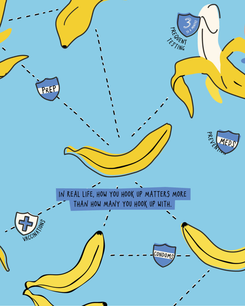
Here’s the truth: Regardless of who your situationship’s ex’s prom date’s roommate’s dog walker once flirted with… It’s not about the number. It’s about HOW you hook up that matters.
– Testing every 3–6 months
– Condoms
– Vaccines, PrEP, & DoxyPEP
Simply put, the sexual risk exposure chart—born of failed abstinence-only and risk-avoidance tactics—is charteganda of the worst kind: regressive, slut-shaming, pseudo-scientific, fascist propaganda that I, for one, am not falling for.
Bananas then, and bananas now. Mushy math and rotten subtexts fit for nothing but a trash bin.
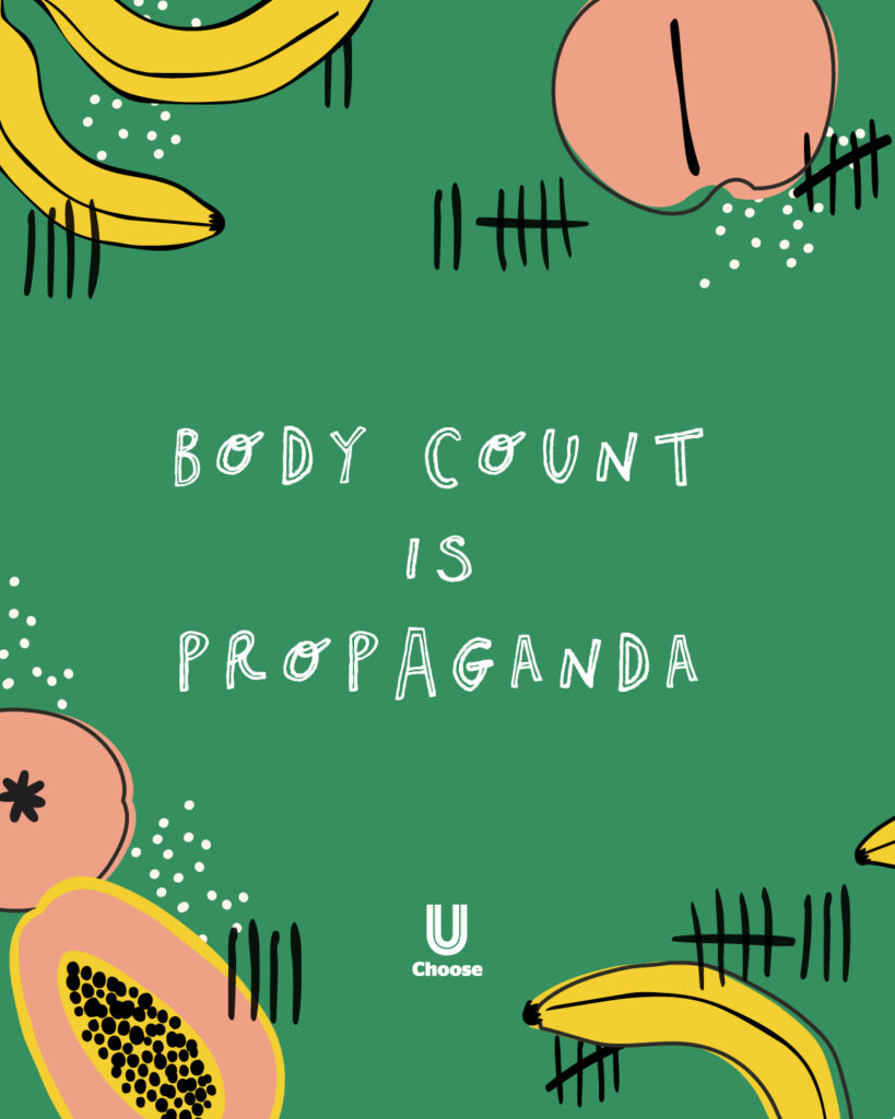
“Body count?” Cute. But babe, that’s the same tired shame-game health class Karens have been playing since forever. Math that don’t math, bad science, and a whole lotta shame.
Real safety? Not a number, hun. It’s testing, treatment, condoms, and prevention—and no, nobody’s [100] every single time. It’s doing your best and striving to do even better.
PHOTO BY: LOUIS HANSEL
Nicholas Sufrinko is a Senior Communications Manager at Healthy Teen Network and is the brand and creative lead behind many of our projects. You can often find him hiking, biking, or stargazing. Read more about Nick.